Monday, 20 June 2016

Bunny Themed Nursery Makeover

neustadt-50

Welcome to the sweetest little nursery for the sweetest little baby ever (except Elliot's and Charlie's and of course all of yours, obviously). It's teeny, tiny, but kinda perfect just like that new little baby that sleeps there. The best part? All, yes all of the furniture and accessories are from my (America's) favorite retailer, Target. It was fast, easy, affordable, and totally steal-able. Hop on in, little bunny.


We were at Jen and Jayson's home, meeting about the upstairs playroom makeover when she showed me the room for their expecting baby. I said, “Jen, no offense, but …may I?” They had just moved in and the furniture was too big and bulky for this room (don't worry, it was handed down to a friend). I was going to be shopping for kids furniture anyway, installing at their house anyway, and honestly nurseries have become old bonnet to me because I've done so many. They are easy, fun, and I figured really good content.


So we lumped it in and we designed/styled that room as well. Here's what it looked like before:


Target Pillowfort Nursery Makeover Baby Girl Pink and White Emily Henderson Before Photo 1

We created a mood board using a combination of Target's new Pillowfort line, baby, Oh Joy and Threshold – the whole gang is playing together here perfectly.


Target Pillowfort Nursery Baby Girl Pink and white Emily Henderson Moodboard

That wallpaper became the hopping off point (HA) of the whole nursery, then we layered neutral furniture and punched it up with the accessories. Keep reading while I break down the whole process – or just watch the video of the whole makeovers:


Welcome home, little baby.  Emily Henderson Pillowfort Target Nursery Makeover Baby Girl Pink-300_A


From now on I'm only designing rooms for the unborn. It's just so easy – you only need a few small furniture pieces (crib, chair, changing table, maybe storage, rug) and none of those pieces tend to be too expensive so there is less stress in the design process, and then yea, the client almost always approves.


Emily Henderson Pillowfort Target Nursery Makeover Baby Girl Pink-35_A

This room was actually only a temporary nursery – for the first year. Upstairs, by the playroom near Sienna's room will be this baby's real kid room. This room is really close to the master bedroom and will eventually be the guest room, so we didn't want to do anything too permanent on the walls. Enter this amazing temporary wallpaper. We found it via Chasing Paper and it is basically just contact paper that you put on your walls. Its perfect for a temporary room as its not pasted and won't last forever. They recommend a really smooth wall for best application. Our wall had a bit of texture but we were fine with it. Our wallpaper installer was not, though and he found it hard to install because he's a total perfectionist. I think when it comes to temporary wallpaper you don't hire someone, do it yourself and don't obsess too much about matching it perfectly. You can shift it, peel it off and replace, and just know that making it perfect can be hard.


It's such a sweet color and pattern – not too busy for a small space but with enough life to add personality (which means you don't really have to do a lot of other things to make it look exciting.)


neustadt-38

The changing table is part of the Babyletto collaboration which is so simple, warm and great to transition into a bigger kids room. We didn't put anything above the dresser because babies have go-go-gadget arms and can rip anything off the walls. We mounted the mirror in Charlie's room with insane glue, and we have definitely hung little mobiles over changing tables, but otherwise keep those little bodies safe.


Emily Henderson Pillowfort Target Nursery Makeover Baby Girl Pink-39

That side table is one of my favorites in the Threshold summer collection. Emily Henderson Pillowfort Target Nursery Makeover Baby Girl Pink-42


I have these stacking white bins in our playroom, too, and while they aren't fancy or particularly stylish, they are so practical – Charlie can access toys easily and help put things away afterwards. For the shoot we styled them out all cute, but as you can imagine ours certainly don't look like that right now.
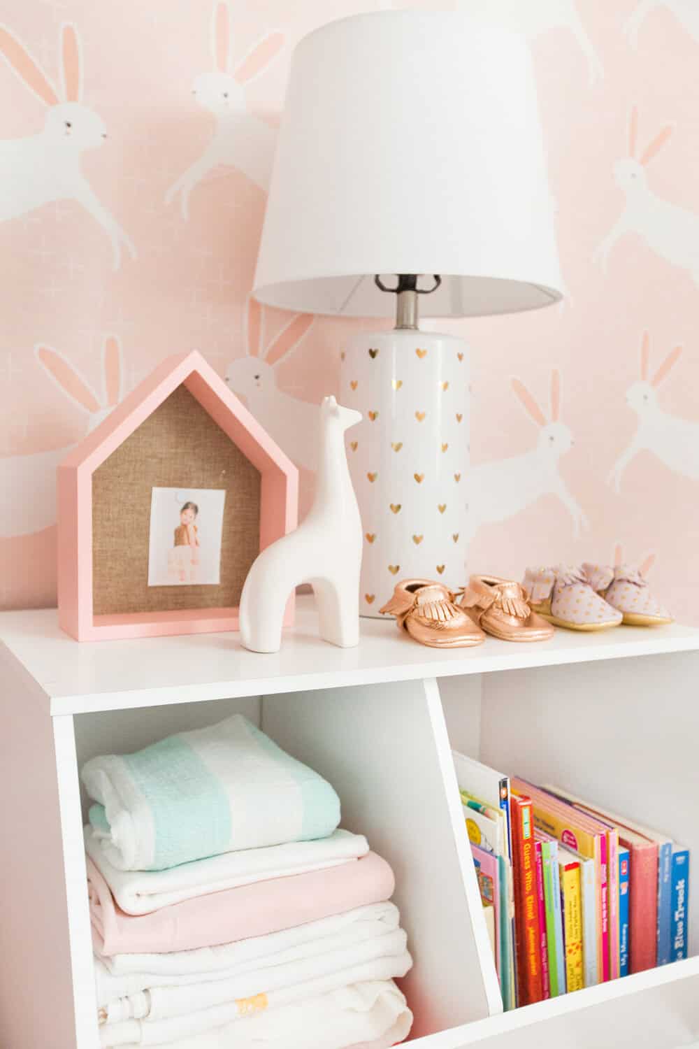

Emily Henderson Pillowfort Target Nursery Makeover Baby Girl Pink-44

I love how the whole room turned out – simple, happy, sweet without a lot of bells and whistles and yet it feels impactful and stylish. Here are a few things you might be thinking:


1. No blackout shades. Jen and Jayson have some rolling blackout shades on their way, but they weren't there for the shoot – so don't worry, they are coming.


2. You may have noticed that there is a mobile hanging over the crib in the video but not in the shots – its a funny story. We made a DIY pom pom mobile for the nursery and it was all sorts of adorable, but I didn't know that Target has agreed to all Safe Sleeping guidelines which says nothing in the crib or over it. Whoops. So we had to edit the DIY out of the video and photos. The wallpaper was so hard to photoshop that we had to send it out to a retoucher to get it done right which is why it took this post so long to get published. There is some footage of it in the video that you can sneak a peek at if you'd like.


Emily Henderson Pillowfort Target Nursery Makeover Baby Girl Pink-100_A

Jen was 36 weeks pregnant there. Yes, life is unfair. And Ive seen her since and she looks like nothing ever happened.


I love this adorable little happy family of three that just got their world rocked by adding another child. While we were shooting I did a decent amount of warning about how exhausting the transition from one to two young children is. I think they were like 'ok, i get it, its going to be hard'. Then when I saw them a couple weeks they both looked at me and said 'YOU WERE RIGHT THIS IS CRAZY HARD'. It gets easier, sweet family, hang in there.


neustadt-93

No makeover story is complete without a proper before and after:


Target Pillowfort Nursery Makeover Baby Girl Pink and White Emily Henderson Before and After 3

All the before furniture was gifted to someone else, don't worry.


Target Pillowfort Nursery Makeover Baby Girl Pink and White Emily Henderson Before and After 1 Target Pillowfort Nursery Makeover Baby Girl Pink and White Emily Henderson Before and After 2

I hope you enjoyed this little bunny themed sweet nursery. If you are into it you can go get that look yourself:


Target Pillowfort Get The Look Baby Girls Pink Nursery Emily Henderson

Sources:


1. Babyletto Hudson 3-in-1 Convertible White Crib | 2. Striped Fabric Floor Bin | 3. Leno Weave Sheer Curtain Panel | 4.  Leaping Bunnies Wallpaper | 5. Floral Bear Throw Pillow | 6. House Shelves With Pinboard | 7. Column Gold Heart Table Lamp | 8. Stackable Laminate 2-Compartment White Bin | 9. Babyletto Bingo 3-Drawer Changer Dresser | 10. Blinky Bunny Stuffed Animal | 11. Party Hedgehog Figurine | 12. Toucan Multicolor Mini Pillow | 13. Round Brass Mirror | 14. Glass Ball Table Lamp | 15. Babyletto Bento Glider | 16. Heart Ottoman | 17. Marlton Marble & Gold End Table


Also available: Newborn Blush & Gold Moccasins |  Cream Plush Shag Rug |  Ice Cream Pattern Throw Pillow | Unicorn Character Throw Pillow


All photos by Tessa Neustadt, video by Propeller Content. 


Enjoy this post? Check out these ones: Neutral (Well, Mostly) California Nursery, Moonrise Kingdom Boy's Bedroom, Playroom Makeover with Pillowfort, Kid's Room Roundup, A Custom Daybed Story, Sara Updates Her Childhood Bedroom – The Reveal.


The post Bunny Themed Nursery Makeover appeared first on Emily Henderson.

Rustic Floral USA Decor

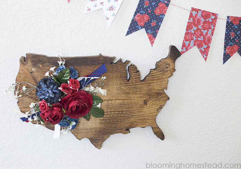
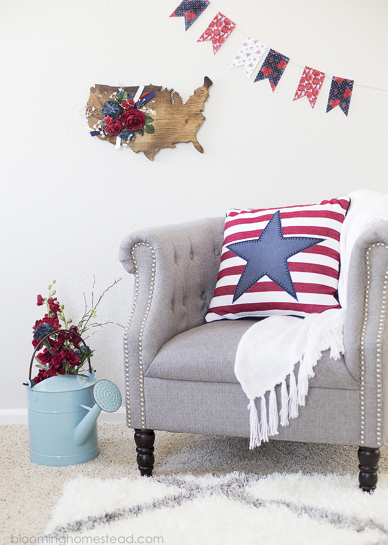
Hi Friends! It's Marie from Blooming Homestead and I'm here to share a fun project with you today. The 4th of July is definitely one of my most favorite holidays and I love decorating in festive patriotic red, white, and blue.  Today I am sharing this lovely rustic floral USA sign. Isn't it lovely?


USA Wood Sign


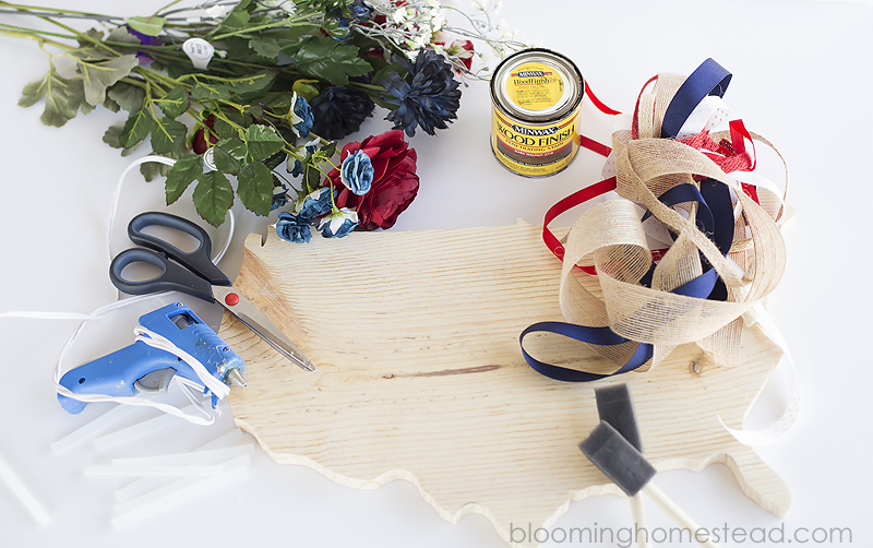
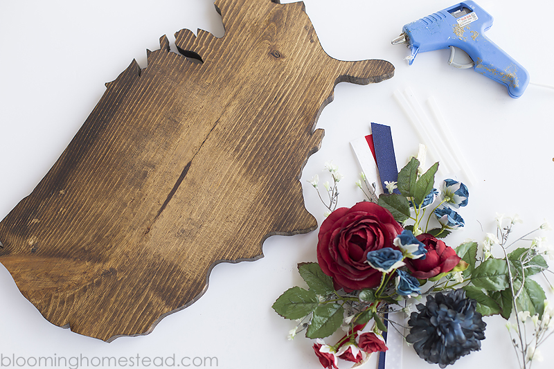
Here are the supplies you need to make your own Rustic Floral Sign:


Wood USA Sign Supplies


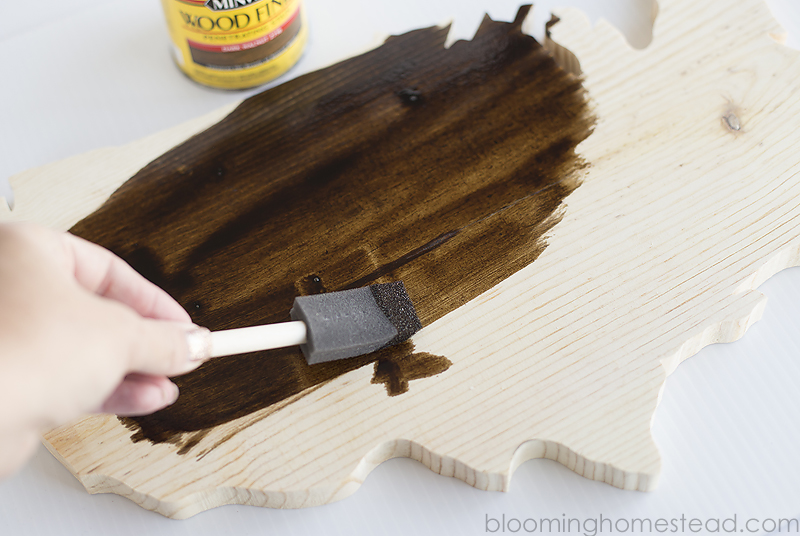
Step 1: You're first step is to stain your wood USA sign. You'll gently sand it if necessary to ensure a lovely finish. When the wood is ready, you'll apply a thin layer of stain to the entire piece. Let it dry.


Stain Wood USA


Step 2: You'll start prepping your flowers by removing the stems from the flowers.


Put it together


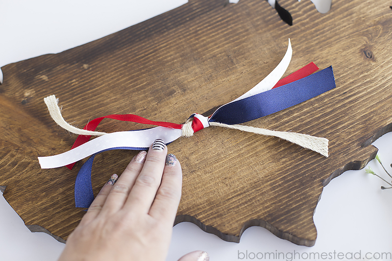
Step 3: You'll also gather a few patriotic ribbons and trim them down to about 9 inches long and tie a knot in the center.


Add in ribbon


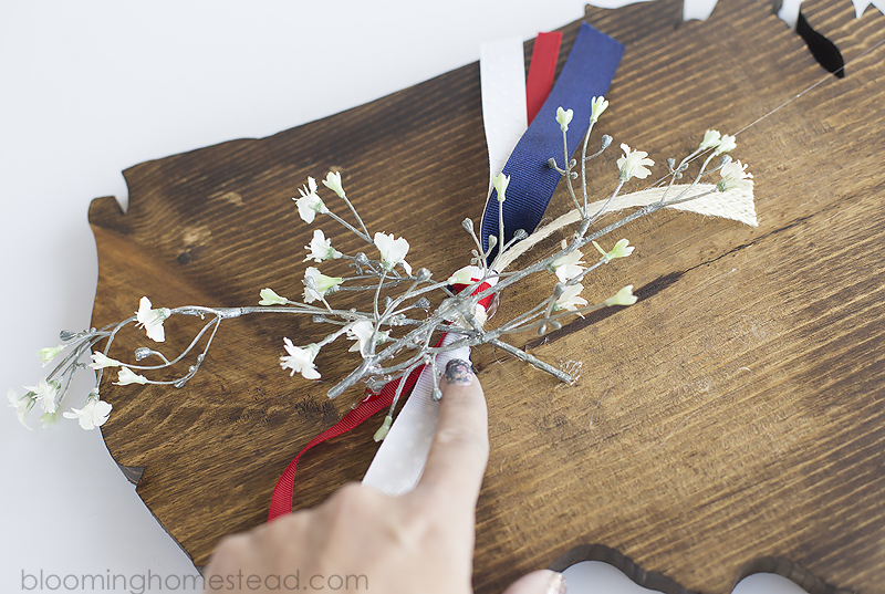
Step 4: When the stain is dry, you'll hot glue your ribbons onto the sign. Next you'll start applying your filler flowers.


Add in filler


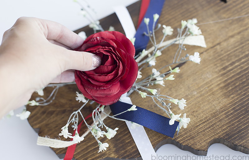
Step 5: Finish off by gluing on the larger blooms.


Add in flowers


Add hanging hardware and you're all set!


DIY Wood Floral USA Sign


Don't you just love how it turned out? Such a fun twist on the iconic USA map. If you are interested,  you can find the free printable floral banner here


The post Rustic Floral USA Decor appeared first on The Wood Connection Blog.

Saturday, 18 June 2016

MY CRAFT CHANNEL: KITCHEN BREAD BOARDS

Bread boards are all the rage in kitchen decor. Today on My Craft Channel we are going to show you how to decorate them so you can incorporate them into your home decor.

Take 25% off bread boards when you shop online at thewoodconnection.com and use code “kitchen” or in stores and mention My Craft Channel. Valid through July 1, 2016


The post MY CRAFT CHANNEL: KITCHEN BREAD BOARDS appeared first on The Wood Connection Blog.

Friday, 17 June 2016

USA FRAMED PLANK

Hey there! Amy here from The Happy Scraps today. I'm sharing this USA Plank Sign with you. Aren't the new plank signs at The Wood Connection so fun?! I love them! When I saw this 14″ x 24″ Framed Plank Sign and the USA Map Door Hang, I thought they'd go great together. Today, I'm going to show you how I put this USA Plank Sign together. It makes a great statement piece for the 4th of July or you could keep it up all year long.


wc-usa-plank-sign


Supplies:


wc-supplies


I taped of the center section of the framed plank and stained it.


wc-stain


While the stain was drying, I painted the USA Map Door Hang white.


wc-paint-usa


And painted the cute little heart with rooster red.


wc-paint-heart


Once my stain was dry, I taped off the outer frame, and painted it white.


wc-paint-frame


Once all my paint was dry, it was time to glue everything together. I glue my heart onto the map, about where Utah is, then glued the USA to the Framed Plank.


wc-heart


I decided after I had it all put together, that it would look good to have the edges of the USA distressed slightly, so I sanded them. This would be easier to do, before it's glued to the plank, but it is possible.


wc-us-distressing


Isn't that little heart so cute. It adds just the right touch to the sign as well.


wc-heart3


Now are you ready to grab the supplies and make your own? This really was an easy project, and pretty quick too.


wc-plank-sign


It goes so well with my other 4th of July decor as well.


wc-4th-of-july-decor


I hope you'll come on over to The Happy Scraps and see what other fun projects I've got there. Thank you to The Wood Connection for having me on their site today. I always love sharing fun projects here.


The post USA FRAMED PLANK appeared first on The Wood Connection Blog.

Thursday, 16 June 2016

Notes From the Road (7) - Sawing in the Swamps

I could sense Ivan's anticipation mount as we turned off the highway. We'd been seeing nothing but southern pine and swamps for a while, and he seemed to know he was about to experience something completely different from the Carpathian mountains. He asked me to stop so he could take a picture of the sign for the Goodwin Heart Pine Lumber Company.

Saw blade on sign...excellent.
As we headed down a gravel road into the swamp, Ivan sat at attention and started taking pictures non-stop. I'm not sure how he translated the sign below in his head, but it was perfect. He was suddenly completely interested in alligators and where they might be lingering.

Vot does "Dead End" mean, exactly?
At the end of the road, we rolled through the gate of George and Carol Goodwin's passion...the headquarters of their Goodwin Lumber Company. George figured out a few decades ago that pulling old longleaf pine and cypress logs from the swamp and rivers in the area could be profitable, and he's been buying and sawing them ever since.

Carol runs the business from a nice office in the front of the property, filled with samples of products made from their products.

Carol's office.

Have you ever seen a floor medallion filled with pine?

Curly heart pine...a unique and elegant look for cabinetry.
George runs the headrig, and as I watched him turn the logs I recognized the experience of one who has been opening great logs for a long time. Each one was turned deliberately until the perfect face presented itself. And what appeared was some of the most beautiful art that nature can provide.


As we stood watching George and his hands at their trade, the unique smell of the old-time Gulf Coast mill took me back to my roots. Fresh-sawn heart pine, with its high pitch content, produces a profusion of that sweet smell that one never forgets, and mixed with the sour smell (think vomit) of fresh cypress, it made for the perfect sweet and sour combination. As we used to say in our mill houses just outside the big mills in Diboll..."smells like money."

You know it's a great business that turns old reclaimed stumps into enduring home construction treasure.
You've seen pecky cypress boards or wainscotting? Well, here's what it looked like before it met the saw.
As nice as the mill visit was, I think what happened next really left the biggest impression of Southern hospitality on Ivan. The Goodwins not only booked our hotel room at a local inn, but they insisted on paying for it...and then they treated us to a fine dinner in one of the nicest trendy restaraunts in Gainesville. And hearing that Ivan preferred vodka to our American whiskey, George made sure that we sampled plenty of single-barrel gold just so Ivan had basis for a fair comparison. I believe our sample size was sufficient.

Dr. Sopushynskyy, looking cool after having checked around the back of the tree for a gator.
Having witnessed the production of one of the finest wood products on this planet, Ivan wanted to learn more about these Southern pines and their ecosystem. We began to explore the coastal southern pine forest the next day.

My Top 3 Design Tips. EVER.

living room eclectic blue green emily henderson_cohesive color palette

I do a lot of media interviews where I am asked what my biggest/best design tips are. I rattle them off quickly and then they are published in random magazines or websites – but rarely have they made it here, on to this blog. In fact, when I brought up the subject of this post, 1/2 of my team didn't even know what my answer would be. So, it seemed time to put them into one place, here on the blog.


If you are a seasoned home decorator, or hell, if you are a designer, then you know that there are no rules, ever, BUT these are guidelines that will help anybody decorate their home with confidence and avoid some big pitfalls at the start. Also, read on to shop a sale I've curated with Gilt.com that features my favorite items to get you started as you decorate with these principles (P.S. there's a discount code at the end to make things even easier).


Tip #1. You can mix however many styles you want, mid-century-country-hollywood-regency-industrial-traditional – ALL OF THEM together as long as you have a consistent color palette peppered evenly throughout the space. This is the number one problem I see – not telling a cohesive color story through furniture and accessories. Choose a few colors that you've always loved, add some neutrals, throw in some accent colors, and then shop and style ONLY within those colors.


blue beachy green lakehouse coastal_cohesive color palette

Now if you are a color genius, or an extremely confidant diy-designer then of course you can do whatever you want – and I've seen rooms look great with 94 colors in them. Most of our clients, as well as myself, like an eclectic mix of styles, right? But I warn that if you have a ton of different styles in a ton of different colors all thrown together in a room, it can look like a thrift store (especially if you have lots of vintage) or even worse a big, busy, messy, cluttered mistake.


Keep it consistent, cohesive and pepper those few colors around the room evenly with a good dose of a neutral spread around. I'm going to write a whole post/video about how to choose the right color palette for you, but the quickest way to do it is to look in your closet, see what colors you seem to be most attracted to, (make sure it's a combination of cool tones and warm tones so it feels balanced), then add some highlights (lighter versions of some of those colors) and lowlights (darker, more muted version). Then neutrals, black, and whites are you friends in most color palettes.


Emily-Henderson_Decorview-Makeover_Bedroom-1

Tip #2. Finding the right scale can be tricky when building a room, but there is something simple that I always go back to: A large room should have large furniture, medium rooms should have medium-sized furniture, and small rooms, (you guessed it) should have more petite furniture. Once the sofa is chosen, scale the rest of the furniture and accessories to that sofa.


midcentury pink palm wallpaper green mint chesterfield livingroom_scale of furniture

Take Nicolette's makeover, for instance – that room was big, that sofa is large, and therefore we had to get larger club chairs and a nice big coffee table (although that coffee table was glass which is good because it's visually light in a room of heavier furniture). You can have some smaller pieces – or we could have done two petite chairs in place of one of the larger club chairs, but there should be a few pieces that are in scale with the room, that really make it feel intentional and balanced.


midcentury living room cup of jo emily henderson_scale of furniture

Now, Joanna had a smaller living room, big for New York, but smaller than most new home living rooms in the rest of the country. Her sofa is medium sized both in length and “visual weight” and has slimmer lines keeping it looking in the middle-sized range.


Tip #3. Every room needs a combination of vintage and new. While I love a ton of vintage, it can start to look like you bought it all at a garage sale (unless it's all high end name-brand vintage). At the same time, if a room is full of all new things, it can look generic and lose personality. Mix vintage and new, and even mix brands and makers to get the room with the most soul.


dining room blue brass simple traditional white_vintage and new

This room started with an antique dining table and that vintage console – we added that wallpaper, chandelier, chairs (all new) then filled it in with some vintage and new accessories. The contrast/mix is what makes the room look lived in and full of soul.


silver trunk antique modern bachelor living room_vintage and new

In this project the new sofa, coffee table, and rug are mixed with the vintage chairs, accessories, art, etc. The vintage pieces have new upholstery which help it look more high end. Again, please note the consistent color palette (black, gray, ochre, brown, neutrals with some green to add life through plants).


tallboy dresser land of lod art_vintage and new

In this vignette, the vintage dresser is accessorized by some vintage paintings (in new frames) some old books, and a new geometric lamp and new vase. It's the mix that really creates the most interesting rooms full of personality.


I do have a few more design principles up my sleeve, but those are my three most favorite, most published, and most helpful to those problems that cause all your design agonies.


Alright, to help you guys get the ball rolling with implementing these principles into your own spaces, I have curated a sale on Gilt.com around each of these principles, featuring some of my favorite items (both big and small) to get you guys on the right track when it comes to following these principles. And even better, you can use the code EMILY at checkout to get an extra 20% off your purchase.


The post My Top 3 Design Tips. EVER. appeared first on Emily Henderson.
Wednesday, 15 June 2016

Lovely Bridal Project Inspiration

Concept Board_LOVELY BRIDE 4

Hello everyone, it's Ginny again with an introduction to a very fun project that we've got in the works over here at EHD. Last fall we were approached by Lanie List, the founder and all 'round awesome Girl Boss of a collection of bridal stores called Lovely Bridal that sell INSANELY beautiful dresses. After seeing the design of the Ban.do Party house on Refinery29, Lanie emailed us and asked for some help to modernize and add some fun personality into the flagship NYC store. She wanted us to create an overall concept for new and existing franchise stores that would make them all feel more cohesive and branded. In the franchise world, when opening a new storefront, each store owner is given a brand guidelines document that is essentially a list of do's and don'ts of how to set up the store in terms of design, decor, and overall vibe. Although Lovely Bride had one of these in place, Lanie wanted to revise it with a more concrete concept as some of the stores had gone off in their own creative direction and away from Lovely's original brand guidelines.


Before_NYC reception

Around the time of our initial discussions, I was in NYC for a friend's wedding, so I met up with Lanie and the NYC store manager Erica to learn more about their existing concept. For the New York location in particular, they wanted to upgrade their entrance area to feel more welcoming and vibrant as it was not only a waiting area but the customers first impression of the store. As you can see, a lot of their existing furniture and lighting feels more romantic-vintage-meets-shabby-chic-meets-French-country which is something they wanted to get away from. Even at the time Lanie mentioned that the store had been quickly put together, but they did have common elements that ran throughout the space (i.e. the overdyed rugs, the crystal chandeliers, tufted velvet and Belgian linen, floral wallpaper, and their signature Lovely Bridal paper picado). I was only there for a couple of hours and had to try really hard to not start moving furniture around to see if the layout could feel any better.


Before_NYC Dressing Rooms

Each one of the fitting rooms had been designed to have it's own theme and some of the elements I really loved – i.e. the floral wallpaper and the oversized gilded mirrors.  Some rooms felt quite traditional, whereas others felt trendy with hot pink dots and gold sequin drapes. Everything was ready for some cohesion, both in the store and the booths.


Before_LA reception
Before_LA dressing rooms

Just so I could get a flavor for another store and to see how much it differed from NYC, I popped into the LA store that was in West Hollywood (now moved to Pasadena).  This definitely felt more pulled together, probably because the store was a lot smaller in size and didn't have as many fitting rooms.  It also helped that the fitting rooms felt more “built-in,” whereas the NYC store had more temporary feeling fitting rooms.


One thing I loved about the stores were the wood floors- they used simple white oak which was a great base for us to work off, and feels modern and timeless.  And the light pink moire paint color, soft enough without feeling too “baby” pink.


In the overall design concept, main elements Lanie wanted us to address were:


– The Reception Area: which would include a custom new wallpaper and reception desk.


– The Fitting Rooms: which would include new drapes and full length 3 way mirrors.


– Lighting: she wanted to move away from the chandeliers since they have been replicated in competitor stores now.


– Furniture: we discussed using a mix of custom pieces that we would design, some wholesale to-the-trade- only items as well as some off the shelf pieces.


With some of the stores having been opened for years by franchisees, Lanie wanted us to select items that could be slowly filtered into those stores. That way they didn't have to fully redesign the whole store, which would be a costly thing to do for each shop owner.


During our conversations, words like chic, modern, sophisticated, romantic, and cool kept coming up, so that helped us to form the direction we wanted to take with the design.


Below is the design concept presentation for Lanie along with our concepts and ideas for each area:


Concept Board_LOVELY BRIDE 5

Our aim with Lovely Bridal is to place a sophisticated, modern filter over an already realized concept. One that can be rolled out to new franchises and existing stores alike.


From the storefront, to the reception and the fitting rooms, each area should feel unique, and most importantly, make the bride feel special as she navigates the space. That's why we aim to make each area feel cohesive and individually balanced by using a select mix of colour with custom and signature pieces of furniture.


The colour palette will take on a moody tone, incorporating varying shades of fresh blushes with deep graphites, and saturated neutrals over a fairly minimalist backdrop, a more tone-on-tone style. We plan to expand the materials palette and introduce brass and rose metallic accents, innovative coloured marbles, thick lush textured velvets, lucite, soft worn leathers, and structured wool felt.


The furniture will take on a more clean and modern approach with organic silhouettes and straight lines giving the store a more refreshed and fun feeling.


LOVELY BRIDE REV D.pdf-7

The reception desk is the first point of contact once you step into the space. We envisage this to be a functional yet beautiful piece of custom furniture that can be adapted to suit each store layout.


We love the idea of taking the plaster moulding, which is an existing Lovely Bridal element, but modernizing it in a way to create a simple, yet exciting cladding for the desk base. This will be further enhanced by the addition of brass or rose gold trim to the front of the moulding which will add another level of detail. Introducing a pink marble into the overall materials palette, we envisage this being used as the countertop.


Allowing this piece to be multi-functional, we suggest adding a glass display case lined with fabric for jewelry and accessories. This will also be designed to hide unsightly printers and other office essentials.


We love the idea of re-imagining Lovely's signature picado into something more permanent and using more robust materials like laser cut wood, brass, or acrylic. This could be done in the traditional bunting style or elevated to become an illuminated screen behind the reception desk.


As a show stopper, we'd love to add a custom glass and metallic chandelier to sit over the desk which will help to really ground the area as a focal point.


Concept Board_LOVELY BRIDE 9


With the reception lounge, we really want to create a tone-on-tone environment, where everything is just simply: a varying shade of blush. From the walls, to the custom sofa and rugs, we aim to combine different materials to create a subtle yet textured, feminine vibe.


We are recommending that the custom pieces stay within the wallpaper, sofa, rug, and neon sign, which can be more one of a kind and signature to the Lovely store. Combining these with existing retail pieces such as the coffee table, light fixtures, and side tables will create a good mix of custom and new.


The sofa will take on a modern silhouette shape with organic curves that help to make it feel more communal. Constructed as a modular piece it allows for flexibility as well as being adaptable to suit each store layout. Clad in a soft worn blush leather, this piece will be iconic to the Lovely stores.


Keeping the additional materials palette to a minimum, accent furniture will be a combination of brass/rose metals mixed with lucite, marble, or travertine.


Taking the traditional Moroccan style Beni Ourain rug and reimagining it with the Lovely colour palette, we can customize the rugs with different patterns and lines to suit each area of the store.


The neon sign in a tonal coral pink will simply say “Lovely Bride” staying true to the brand.


Concept Board_LOVELY BRIDE 14


Keeping with that tone-on-tone style, we're adding some darker colours to the fitting rooms to allow for some contrast and depth. With these areas being the most heavily trafficked in the store, we are proposing full floor to ceiling high drapes in a dark grey ribbed velvet. This gives a luxurious feel, and creates height within the space, whilst also helping with the privacy aspect.


We are proposing a custom three-way mirror wrapped in brass with a faceted bevel detail. Depending on the size of each store, this could be in all the fitting rooms or just be the focal point. We'd also love to add a custom podium using the Lovely wood floor finish wrapped in brass/rose metal.


Where there is need or an appropriate place, full height floor to ceiling mirrored walls could be created. This would help bounce light, add depth and could be done in a rose gold.


… All in all, the direction has been really well received by Lanie and her team and we still have much more to reveal to you with our ideas and plans for the custom furniture pieces, the details of the lighting, and everything else we have planned for them.


What do you think, would you want to find your perfect dress here?


P.S. if you are shopping for wedding dress we highly recommend it – rows and rows of temptingly beautiful and unique dresses. 


The post Lovely Bridal Project Inspiration appeared first on Emily Henderson.